Catarina Glam
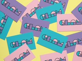
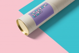
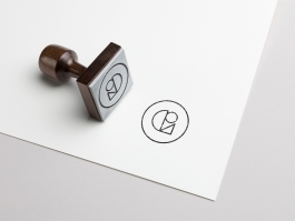
Branding for Catarina Glam, a portuguese street artist and sculptor. The core idea was to represent the most iconic characteristics from Glam’s work: geometric, modular, playful and three-dimensional.
2018
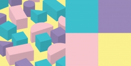
The features mentioned above made me think of products that shared some of those characteristics with her work, like construction games, such as Lego, Tangram or those stacked blocks of wood which children used to play, physical things that you can assemble and achieve almost infinite results.
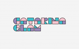
The next step was to define a small number of geometric shapes that could be assembled to build the logo. The word build is important here, because that was the final goal, a logo that could be easily recreated in the “real world”, using three-dimensional pieces of any color and material, giving Glam the freedom to write her name in any medium and format.
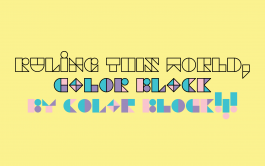
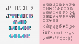
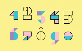
The last step was to create a display typeface, using the new OpenType color font properties to get the full power of the color blocks. The main idea was the same as the logo, just five geometric shapes to build an entire alphabet. It was not an easy task, since there are some complex letters to be build with only five geometric shapes, but this problem could too be turned into a challenging creative exercise to the viewers. To keep it playful, one or more alternates were created for each letter, so Glam could get a different look across words and phrases.
Catarina Glam
Branding for Catarina Glam, a portuguese street artist and sculptor. The core idea was to represent the most iconic characteristics from Glam’s work: geometric, modular, playful and three-dimensional.
The features mentioned above made me think of products that shared some of those characteristics with her work, like construction games, such as Lego, Tangram or those stacked blocks of wood which children used to play, physical things that you can assemble and achieve almost infinite results.
The next step was to define a small number of geometric shapes that could be assembled to build the logo. The word build is important here, because that was the final goal, a logo that could be easily recreated in the “real world”, using three-dimensional pieces of any color and material, giving Glam the freedom to write her name in any medium and format.
The last step was to create a display typeface, using the new OpenType color font properties to get the full power of the color blocks. The main idea was the same as the logo, just five geometric shapes to build an entire alphabet. It was not an easy task, since there are some complex letters to be build with only five geometric shapes, but this problem could too be turned into a challenging creative exercise to the viewers. To keep it playful, one or more alternates were created for each letter, so Glam could get a different look across words and phrases.
© Ivan Alves, 2021. All rights reserved. All materials on this website are the intellectual property of Ivan Alves.
Concept & design by Ivan Alves.
Website last updated: November 2024.
© Ivan Alves, 2021. All rights reserved. All materials on this website are the intellectual property of Ivan Alves.
Concept & design by Ivan Alves.
Website last updated: November 2024.